PREO Srl, active and running on the market since 1938, has always set its goal and its image towards innovation, and our logo did not want to back down!
Around the year 2000 the company logo had already undergone a huge and important transformation, becoming the distinctive brand trait with which our company has been recognized worldwide during the years.
For three generations PREO Srl has been growing continuously, setting its sight to the future, holding on tight to our traditions and to the solid roots from which we come from. Our logo, inspired by the past and the solid path that has distinguished us since 1938, wants to spread its wings and fly high with its gaze to future growth…always leading the way.
From generation to generation our enthusiasm, the growth and renewal aspiration has led us today to desire a new, fresh image, without drifting away from the traditions that have brought us this far.
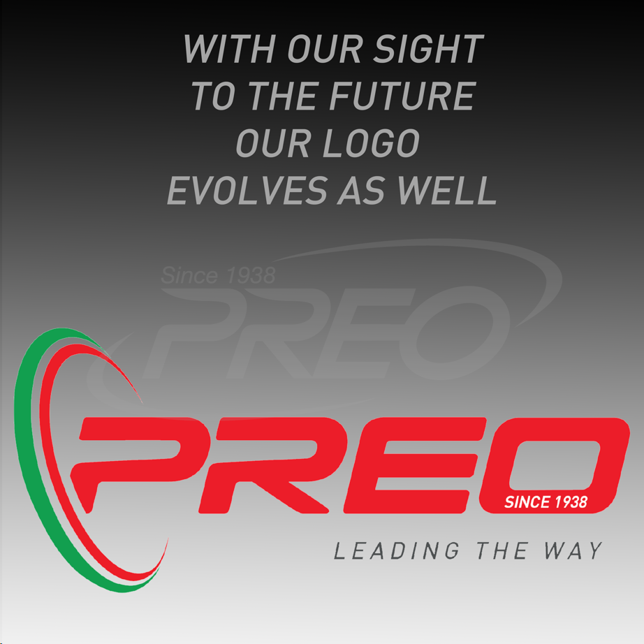
Our logo evolves and modernizes itself, identifying what lies at the base of our product: Made in Italy. The old spirals of the logo meet together creating the Italian flag, which gives a tridimensional trait, light and color to the “P” of PREO, which is our trademark.
From the “P”, revised in a modern and completely Italian key, to the “O”, in which our history and our roots are engraved; this is what PREO Srl is: a historic, Italian, dynamic, innovative family company, ready to grasp and undertake future challenges by tracing the path as we have done up to now.
PREO Srl, Leading the way!